Godot on iPad: Summer Update
This is a long-due update on porting Godot to the iPad. Shortly after my last blog post covering the development work on May 29th, Apple held its WWDC 2024 conference. I went into the conference with gusto, expecting to fully embrace all the iOS 18 APIs. I already knew by then that I would not complete the port before iOS 18 became widely available.
One thing I was not counting on was Apple releasing FinalCut Pro for the iPad, a professional video editing tool. It looked nice on the videos, but I did not expect it to be such a revelation from a UX perspective. While I have been following the Apple Human Interface Guidelines guidance and trying to mimic what other iPad system applications do, FinalCut Pro is packed with small details that have informed Godot for iPad ever since.
The app itself is glorious and a delight to use, and not being a user interface designer, I did not quite understand what made the app feel so good. A few things were more or less obvious like the Final Cut Pro controls for selecting values:

On the surface, this property editor felt better. Most edits can be done with your finger by dragging the value, and fine editing is possible by tapping on the number, which would bring a text editor. While I already had a little popup that would come up when editing a number, my editor defaulted to having a TextField, so it would always trigger the keyboard to pop up to edit.
I had completely missed the now obvious benefit of using a custom data entry popup, which was to avoid getting a system keyboard, one that has all sorts of letters and takes a large chunk of the screen, purely to enter numbers. It is obvious in retrospect, but it was not obvious when I was coding it.
I fell in love with these slide controls. The above one can edit values on a fixed range, but some editors would scroll, and I spent a few weeks reimplementing them and getting the behavior to match it; here are a few of them:
My new data entry controls, attempting to follow the FinalCut Pro idioms.
But beyond these very obvious changes, something more subtle was going on. This is what my test code for a potpourri of properties looked like before I looked at Final Cut Pro:
What made Final Cut Pro look so much better was a combination of things:
- Font sizes for sections, labels and values
- Color scheme used for labels and values
- Tasteful grouping and padding of elements
- Removal of the “lock” icon for linked properties from this screen and moving them directly to the data input
So I set out with Preview and the Digital Color meter to match the colors, font sizes and spacing of the property editors to improve this user experience, and within a few days, I had something that looked a little bit better:

And now, rather than using a popup to edit each value, I now offer an editor that can take care of all the grouped values at once - and the value linkage is now done entirely on this editor. Additionally, a description is shown at the top, plus a “Reset” option, similar to Final Cut Pro:

Then, I noticed that FinalCut Pro did not shy away from nesting values to edit, where I would try to flatten everything out. Here, I had to come up with my idiom, as I expect that some users would not want to dig deeper into the hierarchy to edit values, so I allow users to “pin” a subgroup (I hijack Godot’s existing system for expanding a subtree for this):

Tapping the pin button would put that subgroup in the container.
The work on the new controls and the polishing of the property editor took about a month. I think that it was a worthwhile investment to make the user interface better suited for touch. What surprised me was how big of an upgrade using the proper font sizes, hierarchy of colors and accents brought to the app.
Another upgrade I did to the inspector during the summer is supporting nested property editing. Once I embraced the FinalCut Pro approach of navigation for properties, it came naturally, and now you can edit those properties by simply tapping on the object as well as rendering previews of some properties. In this case, you can see the material for the mesh:

Embedded Windows
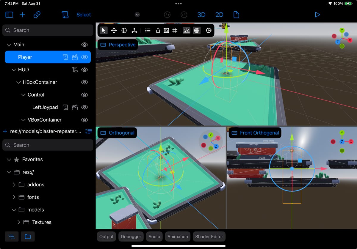
As I have shared over the past year, Godot on iPad is made up of the Godot engine embedded inside SwiftUI, and it started looking like this:

An older version of Godot on iPad shows the underlying editor running.Above, you can see that Godot is still running in full screen, but with a few of the Godot pads removed on both sides. The center of the screen still contains the Godot tab-based scene selector, the toolbar, the per-view menu (itsays“Perspective”), and the bottom bar, which contains various tools.
While this works, I wanted more control over what would be displayed here, so rather than lay things on top of Godot, I wanted to extract a view and fully control it. In my case, I wanted the editor's surface but none of the additional elements. In other cases, I wanted to embed some property controls directly into the property editor.
The Migeran team developed a set of Godot patches that allow me to do this embedding, and I am using them to revamp the user interface.
The first use was to re-host the top editor and the bottom bar directly and then control their display as a group. Then, I graduated to rehosting every single tap on the bottom bar so I could start incrementally rewriting each of those tabs into SwiftUI.
First, I replaced the Output Pad, which looks like this on the desktop:

With this version:
To avoid taking up a whole row for text filtering, I allow each tab to have an optional tool that can be displayed on the right side of the user interface, like in this case.
It also shows some inspiration taken from LogicPro, another one of Apple’s professional tools for the iPad. In this case, I have replaced a difficult-to-grab “splitter” common in Godot with an explicit handle that the user can drag to grow the region, tap to expand, or dismiss with a flick.
Similarly, the native Godot debugger went on a user interface diet, as I do not have the space available:

This time, I drew inspiration from Xcode and Swift Playgrounds. In this case, I collapsed the thread selector to one Picker that allows you to jump to different threads. The entire stack frames pane is also replaced by a single picker (here,showing hello:10), and the variables are shown on the left side, similar to Xcode.
Another Xcode-inspired idea is that the variables and the output live side by side and can be toggled on and on using the small controls at the bottom of the screen:

Toolbars
The next big chunk of work this summer was to provide alternatives to the toolbars and menus used in Godot 3D and 2D editors. I started with the same principle: to be in control of those user interface elements and make them suitable for use on the iPad (and soon on the VisionPro).
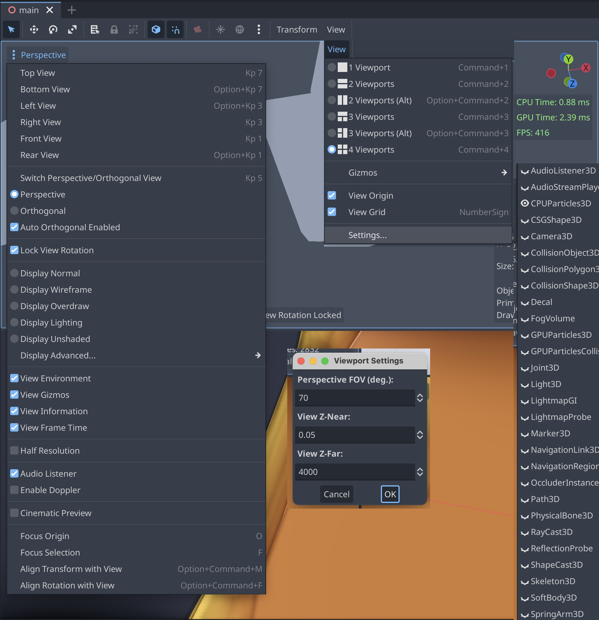
Initially, I felt like I could use the embedding technology to reuse the menus as-is because they were tappable enough. But once I looked at them, I realized they were too busy, had very long lists of data, and would work poorly on the iPad. This shows a partial view of the various toolbar elements for the 3D editor and what they unfold to:
This is what the toolbar looks like now after the iPad-ification was done:

I enjoyed turning a modal settings box for the Field of View, Near Clip Distance and Far Clip Distance into a live setting, so you can immediately see the changes happen. This view is still using the old sliders, but will soon be replaced with the new sliders that I cooked up.
Merging the six different viewport options into a single line saved plenty of vertical space, and merging those settings into the general-purpose settings and letting the user configure them there saved two icon slots on the toolbar for Light and Environment.
Had I designed this six months ago, I would have made the configuration for Light and Environment a long-press action on the light and environment buttons. But the more I use the app and the more professional apps I use on the iPad, I realize that long-press actions are useful for power users, but they are just not discoverable. I am being more mindful and considerate about my users by moving away from this idiom. Very demure.
And this is what I did with the per-view menus:

I might add some icons to the labels, but these look fine to me now.
A similar exercise was necessary for the 2D surface:

It did not seem like I could re-host those user interface elements, it just did not feel right after the 3D user interface had gotten that big upgrade.
So this is what the 2D toolbar turned into:

My goal was to preserve all the features available in Godot and surface them in an iPad-friendly way without sacrificing any functionality. If I had telemetry for which features users were using, I could have left a few things out, but generally, I erred on the side of not leaving things out.
There are two small exceptions, and I made them only after reading the commit that introduced the feature and the discussion on the GitHub issue—they looked like relatively fringe features that had little use. But hopefully, during the public TestFlight, folks will inform me if I made a mistake.
You can tell that I worked hard to preserve all the functionality but also organize the features in a way that would be simpler to find:

You might have noticed the “Control: Anchors” toolbar there. It turns out that I got more than I bargained for. Godot has additional “toolbars” that can be loaded into the toolbar depending on the object that you are editing, so I had to support not only the basics but also other custom toolbars.
As Godot allows scripts and extensions to add elements to the Toolbar, I am replacing the known element toolbars with my own. If I encounter one kind that I do not support, I will merely “re-host” the Godot-native control in the user interface.
That said, my goal is to cover all the popular toolbars from the start so that none of the native ones are exposed and to fall back to the embedded situation when necessary.
I feel like I can do slightly better organization of these properties for Godot on iPad because of the additional user interface elements available at my disposal, like the Picker above or the visual cues for grouping. This is a feeling that I got repeatedly during this exercise. The spectrum of tools available in SwiftUI gave me a richer vocabulary to express the capabilities than the controls that come with Godot - I hope to publish a list of “nice to haves” so the Godot folks can bring that into mainline Godot.
Lastly, I realized that the toolbars are taking some precious space on the user interface, and they might get in the way of your work. I remembered that Apple had a talk some years ago about “Fluid Interfaces” that covered this scenario, for what they called the “Picture in Picture View”. The description starts after minute 41 of the talk.
So I brought that user interface idiom to the toolbars, allowing users to “flick” the toolbar to one of the four corners of the user interface to get out of the way:
Moving the toolbar around
Other Work
Miroslav has been an invaluable partner in this SwiftUI adventure, and while he had initially just focused on the SwiftUI components, he has recently taken over rewriting many of the full-screen importers for Godot. We realized early on that some of the importers in Godot were great, but again, they would take up all the space and did not fit at all in the iPad, it was not even possible to reach all the elements of the UI.
He rewrote the Scene Importer and the Audio Importer, which were large projects on their own:


Next Steps
One thing that has been bothering me is how to activate/deactivate panels on such a small screen, and I had my share of poor man’s hacks. Logic Pro introduced me to an idiom (and while it is in FinalCut Pro, I was not paying enough attention to see it): small icons at the bottom of the screen. I spent the last week redoing my bottom bar to incorporate this idiom.
I lack a “Scene Switcher” (what Godot has in tabs). The way to switch scenes is to select the file directly, but that feels clunky, so that is next.
In addition to these two high-level topics, I have some fifty-nine other small bugs that need to be fixed before this is suitable for a TestFlight, and I hope to finalize those in September.
My hope is that while I collect feedback for this beta and fix bugs, I can look into integrating Apple Pencil support, spend some quality time on the touch interactions for it, and make sure that Godot on iPad really shines as a touch-first experience.