Xogot: Animations Tab
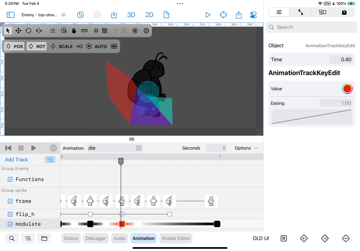
Let me start by apologizing for not posting updates more frequently. I am sure a better engineer would have found the time to use an AI bot to write this, but instead, I have decided to expand my list of unmarketable skills and write this update on my own - with no AI involved - so buckle up for a wild ride into mexicanisms, grammatical flaws and imaginary word constructions.
This past December, I touched on the work that we did to rewrite Godot's Sprite Frame tab in Godot to mobile - at the time we were starting to hear from our users that they enjoyed the nativeificated versions of our user interfaces. What I neglected to mention is that in the back of my mind, I kept thinking about Juan Linietsky’s comments from his GodotCon talk - in particular the part where he talked about his experience building games and the importance of having a good tool to put together your assets into a complete game.
It was a good observation at the time, but the more I thought about it, the more I realized that one thing that Godot on iPad should do is to make sure that the experience of bringing those assets together needed had as little friction as possible - and users should enjoy the process of putting things together.
We ran a poll asking our users what they they liked and disliked about Xogot after a month on the beta, and unsurprisingly they enjoyed the parts of the UI that had been tuned to work on the iPad, and did not enjoy the experience when we went fell back to the original Godot UI. There were two big components where users were running into this: the TileSet/TileMap pads and the Animation pad.

The bug count was under control, the Kwanza and Christmas spirits were in the air, as well as our love for the LGBTQ community, so we decide that it was now or never. So, we decided that it would be worth delaying Xogot even more, if we could bring joy to every user that had been having a good time, right up until they smacked into the wall of tiling and animations.
This festive spirit could only bring us so far. I did not realize just how much code lived behind these components (Two thousands lines of code here, seven thousand there, another two thousand over there). My secret weapon was SwiftUI’s new @Observable macro. What would have under other circumstances been a war of attrition and a guaranteed recipe for burnout, turned out to be a fun month of coding.
To recap our last ten blog posts: Godot is optimized for large displays, and we are trying to both compress that into an iPad-sized experience and make it touch friendly.
This is what I was starting with:

The area that I want to focus on today is the area highlighted in blue

My job was to make this UI touch-friendly, shrink it for smaller displays while bumping the size of almost every element and, as readers of this blog know, I did not want to pass on the opportunity to simplify some of this UI.
The richer set of controls available on SwiftUI generally have allowed me to simplify the user interface and to bring some clarity into the experience that is otherwise lacking. A topic I hope to explore in a future blog post.
It is not just that SwiftUI has a richer set of idioms, but also that I get to rewrite the code, so I get to rethink how things should work - and many times when developers are adding features to a product, they add them with the most expedient tools in the most expedient place. Followers of this blog by now know that we are not operating under expedience principles.
Godot is a great tool to use if you already know what you are doing, but I often find myself hunting down things in the UI that should just be delivered to my doorstep. When you open a new scene in Godot, if you activate the “Animation” tab, you are presented with this message:

It is a fine message, and one that I initially replicated faithfully.
But after a month of working on this UI, it started to grind my gears. The grinding of the gears turned into anger, and in one of the countless showers I took in January, I came up with an idea: an empty tab should offer to open an existing animation if one exists, or offer to create a new one, so this majestic UI was born:

The only reward I want for this - and the only reward I am getting - is the joy of not being constantly annoyed at having to tap tap tap tap tap to get to the point. You might not like this, but this is what peak product development looks like.
Once you tap that “Open existing ‘anims’” button, this is what you get:

Some of the UI elements remain similar, others were changed. I still show tracks, and checkboxes to toggle them on/off, but I decided to hide the animation configuration option, which are instead displayed on the track:

Astute readers will notice that I have a “Change Path” option there, which is my version of rename. You might wonder“Why don’t you do tap-to-rename on the node genius?”. Well, we had implemented that feature across the board in Xogot to great pain, only to find out that it is just too easy to trigger the rename operation, and it is disconcerting. So we are going away from “If you tap on the selected node it becomes a rename operation”. A little bit of me died when I had to remove the code, but my cortisone levels came down as a result.
When I started on this project, some of the features were confusing to me. For example, if you click on “Animation,” here are the options that you are presented with:

The first option seems fine, the second is a bit confusing - but you soon realize that this is a UI to manage your collection of all animations (and libraries of animations), so sort of a “global” thing. The duplicate, rename, edit transition and open in inspector actions are relative to the current animation.So you really have three different targets here - creating objects, managing objects and performing operations on the current object.
There is another companion at the bottom of the screen that does other things:

The first button toggles the view into Bezier editing mode, the second toggles visibility for some nodes, the third grouping, the fourth snapping for the timeline, the fifth snapping for the keys you add. Then we have the “frames per second“ and whether you prefer to work with frames per second or seconds - and lastly a zoom factor/auto-fit system.
I decided that some of those options really were properties of the animation, and made those accessible when the animation is selected:

This grouped the features that are specific to an animation to the animation - it makes it clear that the “Edit Transitions” is a property of the animation itself, not a global operation. I moved the global operations to the “Options” menu (I will likely rename this - as it hosts a bunch of commands, not really options).
As you know, I love looking at Apple’s iPad pro apps, and I ran into a lovely piece of UI in FinalCut Pro, so I borrowed the spirit of that design for configuring the snapping settings in the animation:

I know what you are thinking “Miguel, isn’t the Display Units a global setting in Godot? Why are you putting it there? Gotcha!”, yes, you are technically correct - which everyone knows is the best kind of correct. What I was trying to optimize for was letting the user choose the snapping units between setting it as seconds or frames per second, so I decided that replicating the information for the comfort of the user was worth the intellectual discrepancy.
Next up, selecting key frames and inserting keys frames.
In the desktop edition of Godot, you right click on the timeline to insert a new key into the timeline. On the iPad, an approximation would be to long-press on the location and get a menu - but I found this just too uncomfortable to use.
Luckily for me, both Logic Pro and Final Cut Pro feature animation timelines, so I went to look at what they did, and I found Final Cut Pro’s touch interface ideal:
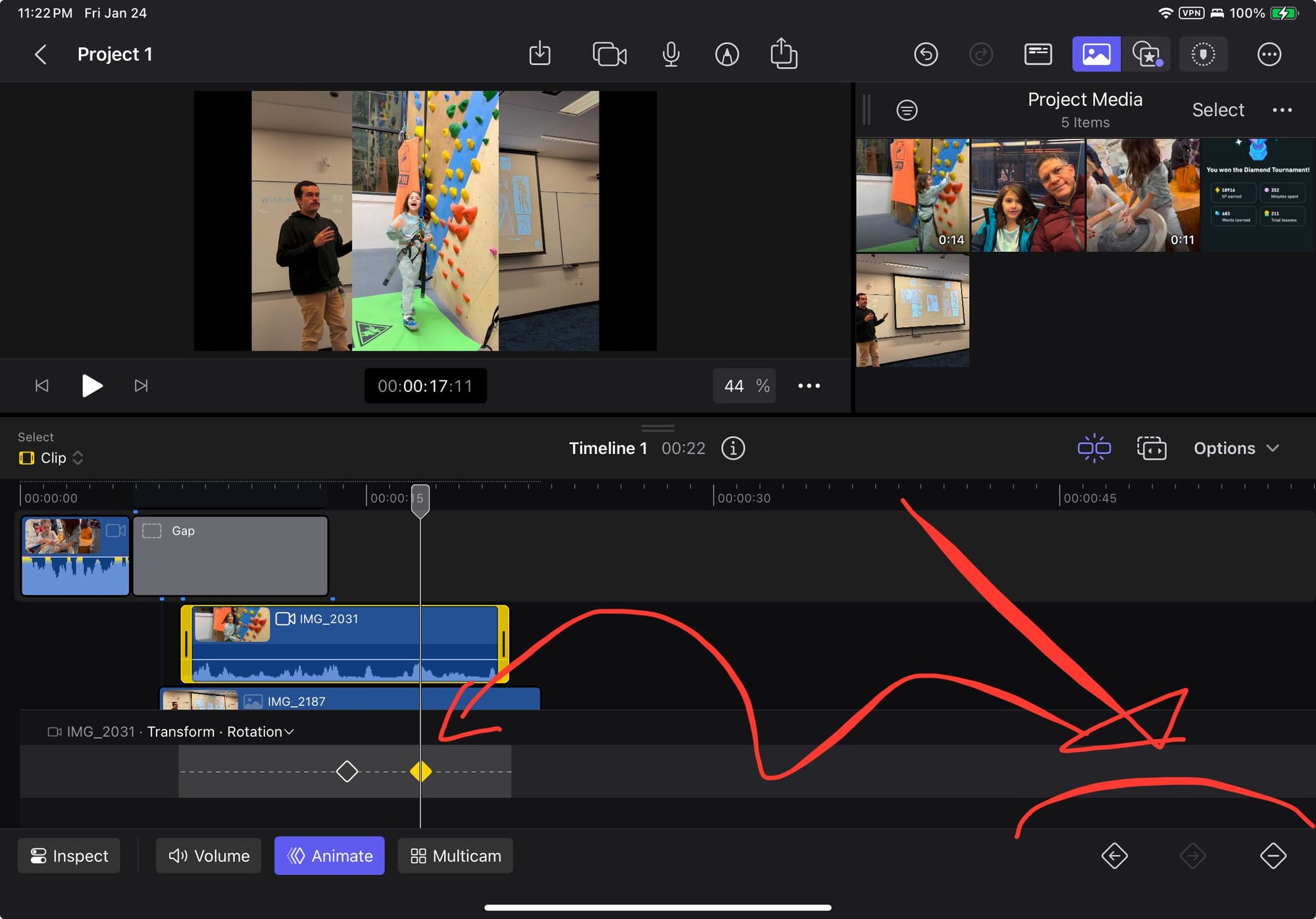
The interesting element in FinalCut Pro is that insertion and deletion of a key is always done on top of the time marker. So you move the time marker to the desired location and then tap the “+” diamond button at the bottom of the screen. And you remove a marker in the same way.
This avoids the obnoxious long-press gesture to add keys.
The other deviation from Godot is that I auto-select the keys on a track as soon as the timeline marker is on top of the key, just like Final Cut Pro does. I found this UI to be comfortable to use on the iPad. My take on this concept extends it to add an [R] button which is used in Godot to add value into the RESET track.

Some other changes include the Cross-Animation Blend times:

And my iPad-ificated version:

The Animation Libraries is another example of the SwiftUI/HIG idioms being less intimidating:

For full disclosure, I show the menu that abstracts some of the features away:

No UI is complete on iPad OS without some cute animations, and this track editor is no exception! Here is the animation that runs when you choose to group and ungroup:
Grouping animation for the track editor
One thing that I found overwhelming while working on this was creating sprite animation tracks, as you need to select your sprite, and then scroll through a list of properties to find the one you want. I figured if I was struggling then many others probably would be, too.
In addition to Godot’s standard set of properties, I added a shortcut to “Add Track” to add sprite animations directly. This is merely a shortcut to filter nodes that can be animated as sprites, and a filter for the sprite animatable properties:

Which gives you this beauty:

I am still missing a few pieces. You can track the progress on the release notes here: https://docs.xogot.com/documentation/xogot/preview-1/
Then I remembered the SpriteFrame UI from last month:
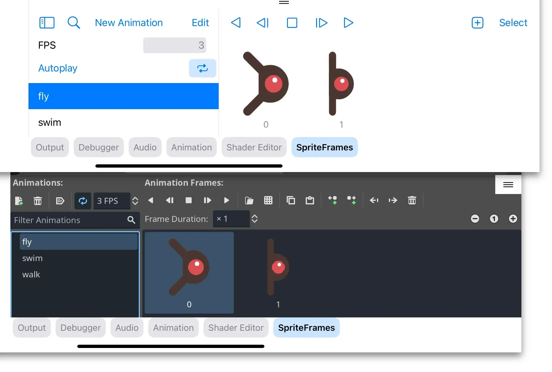
While it is slightly cleaned up, fundamentally it uses the same layout as Godot's UI - and I have never been quite happy about it. As I was writing this blog post, I realized that I did not like the player controls in the middle of the screen, that I hated the left side-bar taking all that space, that the FPS/Autoplay/Repeat controls felt capricious and were bound to an animation. And here I was, basking on the glory of the new Animation Tab, and realized - that I could vastly improve the SpriteFrame tab if I borrowed the playback controls, and moved away from a master/detail hierarchy for the sprite animations into a system similar to the animations tab. The pop-up menu would now host the key operations of an animation, and we would gain the space from the left column.
Here is the result:
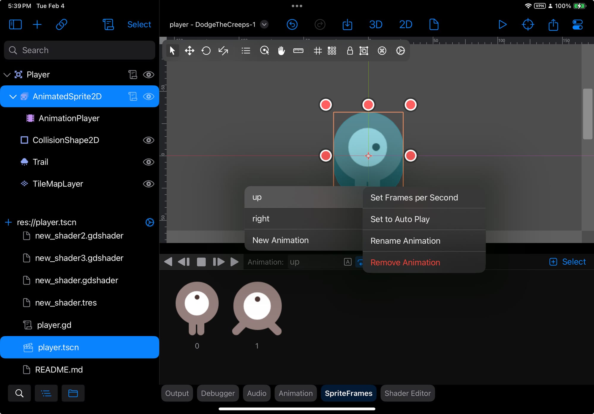
In what appears to be a recurrent theme in my life, this looked a lot simpler than it turned out to be. Had I known what I know now, I would probably have found a creative excuse to not do it. That being said, those 13,000 lines of code on the TileMap editor are not looking so bad now.
Until next time!
