iGodot: Split View

This is part of the "iGodot" series of blog posts where I discuss the design and engineering decisions for adapting Godot to be a bonafide iPad application.
You will find some familiar elements when you first launch the Godot Editor on a desktop. The UI is divided into three major sections:

The left side tracks your scene hierarchy and your file assets; the middle contains your main editing surface, and the right side includes the property inspector. These elements are present in other development environments like Visual Studio or Xcode. They all have some bespoke support for hiding, collapsing, or moving these panes to different configurations.
One of the recurrent themes in designing for iPad (or the iPhone) is to make the user interface elements that can be tapped large enough to reduce surprises, account for a broad spectrum of finger chubbiness and dexterity, and work across a wide range of iPad sizes.
The iPad design guidelines recommend button targets to be 44x44 points.
We found that the tight packing of controls on Godot made it error-prone, and the ever-present pads that work great on a desktop are less comfortable on the iPad.
The SwiftUI versions of the same UI elements show this subtle difference in sizes; on the left side, you can see the default size for user interface elements in SwiftUI, and the right side shows the tighter desktop version of it:

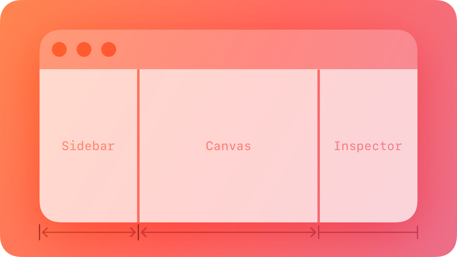
This is not just a challenge with how much information can be packed vertically but also how much information can be packed horizontally. The good news is that we are not in uncharted territories. It is common to have a similar hierarchy on the iPad for some of those elements. Apple even has a standard idiom for this that looks quite similar:

This idiom is supported directly by Apple’s APIs.
Not only does SwiftUI’s NavigationSplitView support this idiom out of the box, it also comes with behaviors suitable for iPad applications. For example, the sidebar automatically hides when the iPad is used in Portrait mode and otherwise displays controls to hide and show it.
The sidebar and inspector can either compress the canvas - so elements are visible at the same time, or they can slide temporarily into the screen to make some changes (and we automatically get a darkening effect on the canvas region to indicate that the surface is not active).
In Godot, the two elements on the sidebar play an important role and are used extensively - not only to explore your game hierarchy and control what is being displayed on the canvas and the inspector but also to control several key operations directly from these pads.
Given these considerations, we decided it was worth using the native iPad functionality for managing the sidebar and the inspector and writing SwiftUI-based versions of the user interface elements hosted on those two components of Godot.
Code
This is where we cross from the UX decisions into the impact that this had on the code and the idiom that I am adopting for Godot on the iPad.
While the user interface is written using SwiftUI, it must extract information from Godot, send commands to Godot, and interoperate with the Undo/Redo stack in Godot. All of this is achieved by using the SwiftGodot bindings that allow me to use Swift to control Godot.
Luckily for me, the Godot team has surfaced a wealth of capabilities from the Editor to their binding system - this means that Swift has access to plenty of the Editor surface, allowing me to access the Editor capabilities from Swift. Unluckily, not all the capabilities I require to write everything in Swift have surfaced.
Additionally, there is a wealth of information, accumulated knowledge and product polish in the underlying platform that I do not want to re-implement and debug again.
So, the path I have chosen is to extract the information required for the code in the SwiftUI world to do its work and have the UI call back into the native Godot code to carry out its tasks. That means that in practice, there are two sets of“Scene Pads” active in memory, but one instance is used to interact with the user, while the other is used as the engine that carries out the work on behalf of the user.
For the various gaps in the API exposed by Godot, I am surfacing the capabilities to Swift - the Godot GDExtension is rich enough and powerful enough that surfacing additional capabilities is a breeze.
The benefit of using the above approach is that there is less code to maintain less code and iGodot quickly inherits the improvements happening to Godot. It is by no means zero effort, but the little duplication strikes a good balance with my desired user experience outcome.
Learn More
“Designed for iPad”
https://developer.apple.com/videos/play/wwdc2020/10206
“Inspectors in SwiftUI: Discover the Details
https://developer.apple.com/wwdc23/10161
“Split Views”
https://developer.apple.com/design/human-interface-guidelines/split-views
“Layout - Human Interface Guidelines
https://developer.apple.com/design/human-interface-guidelines/layout
“Buttons - Human Interface Guidelines
https://developer.apple.com/design/human-interface-guidelines/buttons
“SwiftGodot”
https://github.com/migueldeicaza/SwiftGodot
