Part 3: iGodot: ScenePad
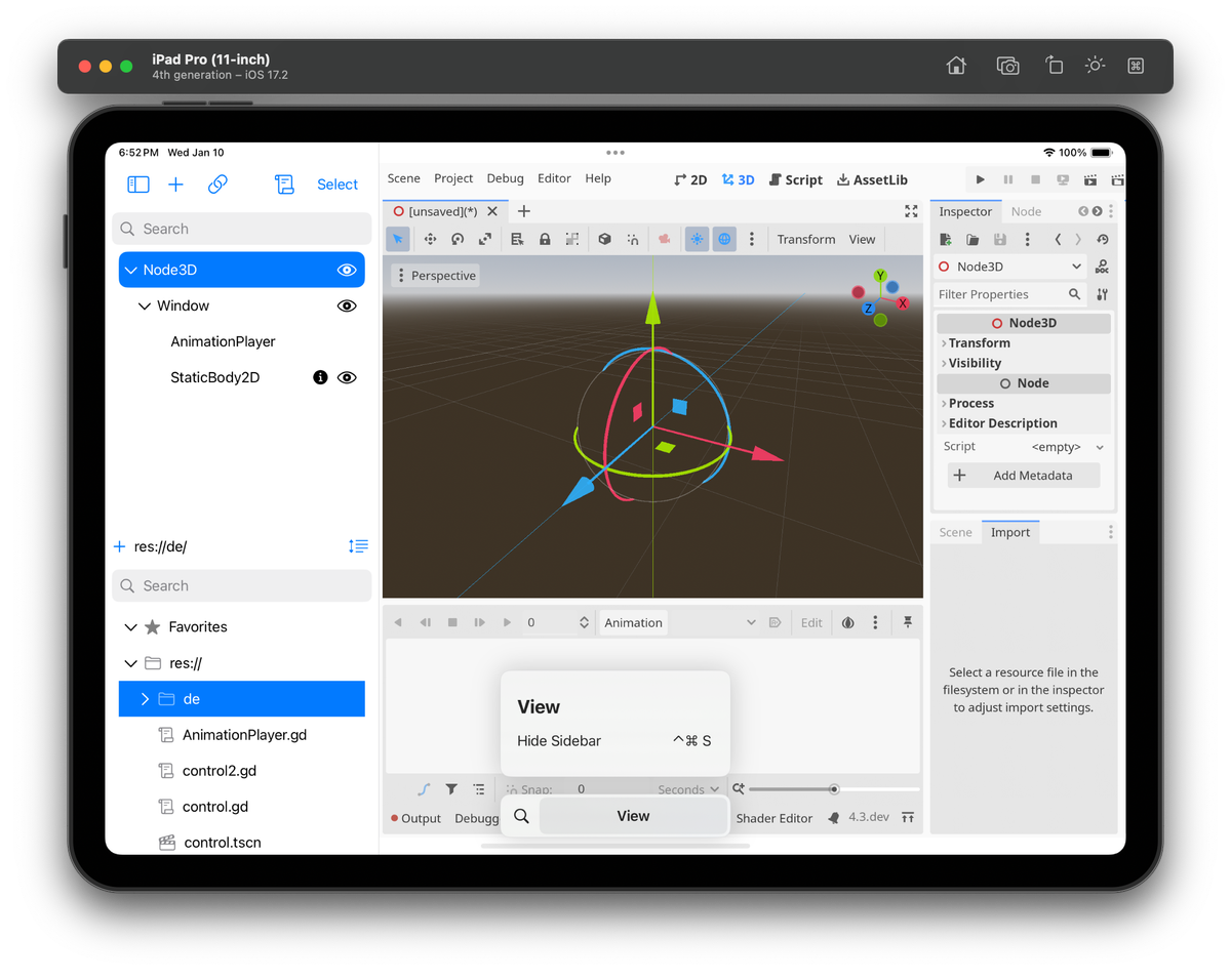
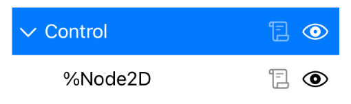
In the previous post, I discussed the role of the Split View on iGodot. In this post, I will discuss the ScenePad, which sits at the top of the sidebar on the left:
The ScenePad plays an essential role in developing your game. It provides a way of managing the game hierarchy in any given scene. You can use it to visualize the hierarchy of nodes you have created, organize it (things like naming your objects to have meaningful names), change the types, extract parts of the hierarchy into their scene, and add new nodes to your scenes.
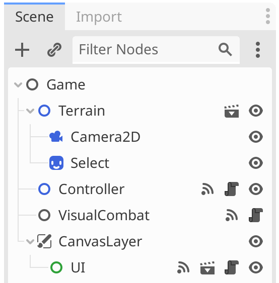
The desktop edition of Godot uses a tree control packed with features that work great with a keyboard and a pointing device.
One of the places where this becomes very clear is with multiple-item selection. On the desktop, multiple-item selection uses the shift-click idiom, extending the current selection by holding the shift key and clicking on a new item.
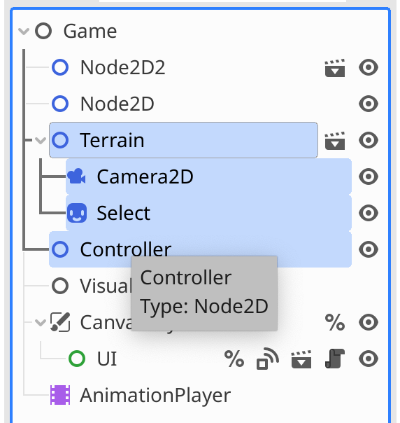
On the iPad, we can not rely on the keyboard being present to provide this modifier. We looked at how other applications on the iPad were solving this problem, and we settled on exposing two mechanisms:
- A "select" button is available on the ScenePad that turns on selection mode. The user can tap on different items to extend or reduce the selection.
- Swipe action: to avoid going into a selection mode, I am binding the swipe-right gesture to toggle on/off the selection of an item.
You can also swipe in the other direction, and I am taking advantage of the two-stage swipe features. If you do a short swipe, you will get two options: delete the node and show information:
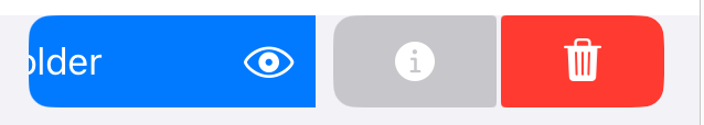
After you swipe, you follow up with a tap. If you do a full swipe, you trigger the delete action directly.
Row Clutter
Even with a high-resolution iPad, the default font size is still large compared to what folks use on the desktop.
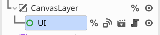
On the desktop, for each row in the ScenePad, the tree display consumes some space, some by the node name, and the rest is dedicated to showing various indicators and actions.
These include:
- Visibility toggle
- Opening a sub-scene in the editor
- Opening an attached script
- An icon to indicate that the node has a unique name, and tapping on it will disable it
- An icon to jump to the signal definitions or group definitions
- An indicator showing that the node is locked.
- Whether the AnimationMixer linked to this node is pinned (tapping will unpin from here)
- A button to show node warnings
- An indicator that the node belongs to a group and, if tapped, will remove the node from the group.
While I have yet to see all eight buttons used simultaneously, things get busy, even with three icons. For inspiration, I looked at what drawing applications with layers were doing. They solve this density problem by using much larger rows and placing the icons on the four corners - but their domains help them use the larger space effectively, as they can put tiny image previews there.
It is not unusual to find rows that look like this:
I have been struggling with just how far I should go in making changes to Godot. I could make the minimal changes acceptable and ship it. Still, anyone who has simmered long enough in the Apple ecosystem can relate to the joy of using an application tightly integrated into the operating system and designed to work well in it.
I fear making too many changes can confuse or alienate seasoned Godot users - if they can not find their way around Godot for iPad or if my design changes miss the mark by a far shot. I also fear that newcomers to Godot following an online guide or tutorial might get frustrated if they cannot find where something has been relocated.
I am betting that I can ship a delightful blend by leaning heavily on the Apple Human Interface Guidelines and drawing inspiration from other design and development applications on the iPad.
By now, I hope you can relate to my desire to adjust the user interface to be a good iPad citizen and make Godot shine on this platform.
The Toolbar
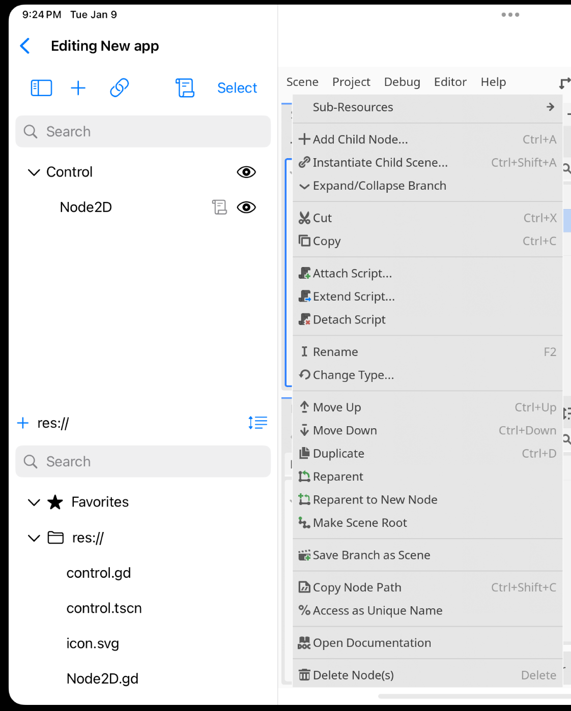
At the top of the scene pad, Godot has a small toolbar where users can add new nodes, locate nodes, attach/remove scripts in a node, and get some sorting options:
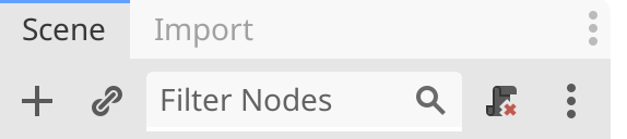
This is the initial reproduction of this UI:

You use the scroll icon to attach scripts to your nodes, the Godot way of quickly wiring up the behavior in your game. So, this icon had to stay because it is a staple of development with Godot.
The toolbar was acceptable for a while, but I started to feel like someone was poking me in the eye with a tiny green plus sign. And when the icon changed to red, the poking added insult to injury.
Many years ago, I read an article on user interface design that discussed the need to avoid very dark regions in your user interface, as your eyes would naturally flow toward them. Once you see this, you can not unsee it. And you start to get virtually poked in the eye all the time.
In SwiftUI, you even get some baked-in help for precisely this problem. When it comes to your user interface elements, you can quickly dim things out by changing their color from the default `.primary` to the `.secondary` one.
So I changed this to have a single color, but altered the behavior, and leveraged another iPad idiom:
- If you tap on it:
- If there is no script on a node, it attaches a script
- If there is a script in the code, it prompts whether you want to remove the script
- If you perform a long press:
- If there is a script, it offers a menu to remove it from the node or to add an additional script
- If there is no script, it shows the add script option.
This is the end result, no more eye poking:
Node Rows
I decided to put the row on an icon diet. But first, I reduced the intensity of the icons to `.secondary` so that they do not accidentally become the show's star.
I kept the following indicators/tools:
- Visibility Toggle: I decided to keep the visibility toggle, as it is a helpful shortcut, a well-known idiom, and a tool present in every design/paint program with layers.
- Scene and Script icons: keep them; my limited research shows they are commonly used.
- Lock flag: seems worth keeping, as users might not have to answer "Why I can not make changes to this?". But this icon is walking on thin ice.
- Warning icon: if Godot has flagged a node as not being fully configured, tapping this icon will bring up an information panel.
I removed these:
- Signal and Groups indicators: When clicked, these buttons would change the inspector tab's default page. Users understand how to use inspectors well, and these shortcuts are unnecessary.
- The Animation Mixer un-pin icon. I tried finding a user for this in Godot but could not. So, this was an easy removal.
The Unique Name Indicator icon is the symbol '#', referencing how you access this node with GDScript. When you press this icon, it removes the "Unique Name" attribute from the node.
When I Googled for the usage of this, I found two interesting discussions:
- Someone who uses this extensively complains that this button makes it too easy to remove a vital attribute accidentally. They are pleading to get it removed.
- A proposal to move the unique identifier to a new location, given how important it is and how easy it is to miss it.
So, I moved this indicator to the beginning of the row, as the proposal suggested, and turned this from an actionable button into an indicator. Hence, there is no chance that a user would accidentally remove the flag.
This is what it looks like:
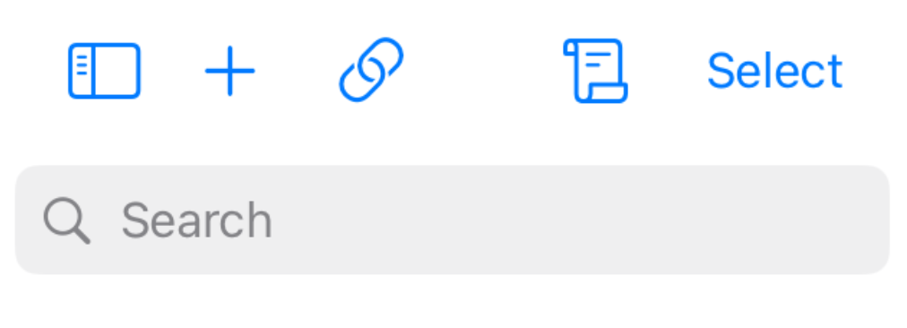
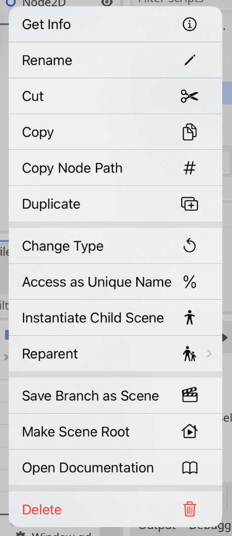
Context Menu
When you activate the context menu in plain Godot on the iPad, this is what it can look like:
This context menu is the launching pad for actions on the nodes, and the contents vary depending on the node's state. I felt overwhelmed with all these options and adjusted the context menu.
This is my reworked version of the menu:
The significant changes are:
- Follow the Files.app pattern and put "Get Info" and "Rename" at the top. "Get Info" hosts information that I removed from the individual rows - like which groups the node belongs to, connections, lock status, and other tidbits.
- Grouped the editing operations cut, copy, copy node path, and duplicate.
- Attach/Remove/Extend script options were removed - as they are accessible from the ScenePad.
- Merged two "Reparent" options under a submenu, saving me one row.
- The Delete operation uses the iPad idiom of being flagged as a destructive action.
- Remove functionality available by other means (Like "Expand/Collapse branch").
With my constraints, some of the redundancy convenience of Godot works against me. Removing these redundancies will help me simplify the user interface.
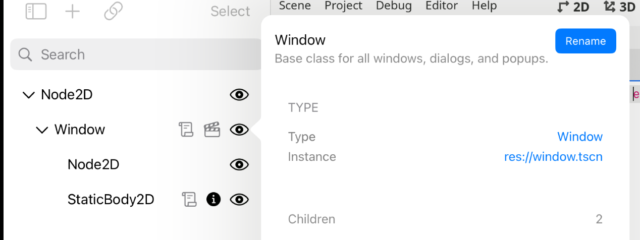
Get Info is used to display information that Godot shows in the row using the hover tooltips - but those are not very useful on the iPad:
Working Without Telemetry
Godot does not use telemetry, so it is challenging to know the most used commands and the most used user interface elements or to understand which paths could be optimized. Large companies routinely collect a wealth of telemetry data tracking all of this information; one of my favorite talks on the subject was Jensen Harris' talk about the development of the Microsoft Office Ribbon.
Sometimes, I did not know how people used a feature, so I relied on Google to find online discussions about it, and sometimes, I found real jewels that either confirmed my concerns or suggested alternatives.
Iterating on the design
Even the best user interface plan survives contact with the end user. Think of these user interface changes as a first treatment.
I aim to keep iterating on these user interface changes based on your comments and new iPad/UX idioms I learn about.