Godot on iPad, Part 8: Code Editing
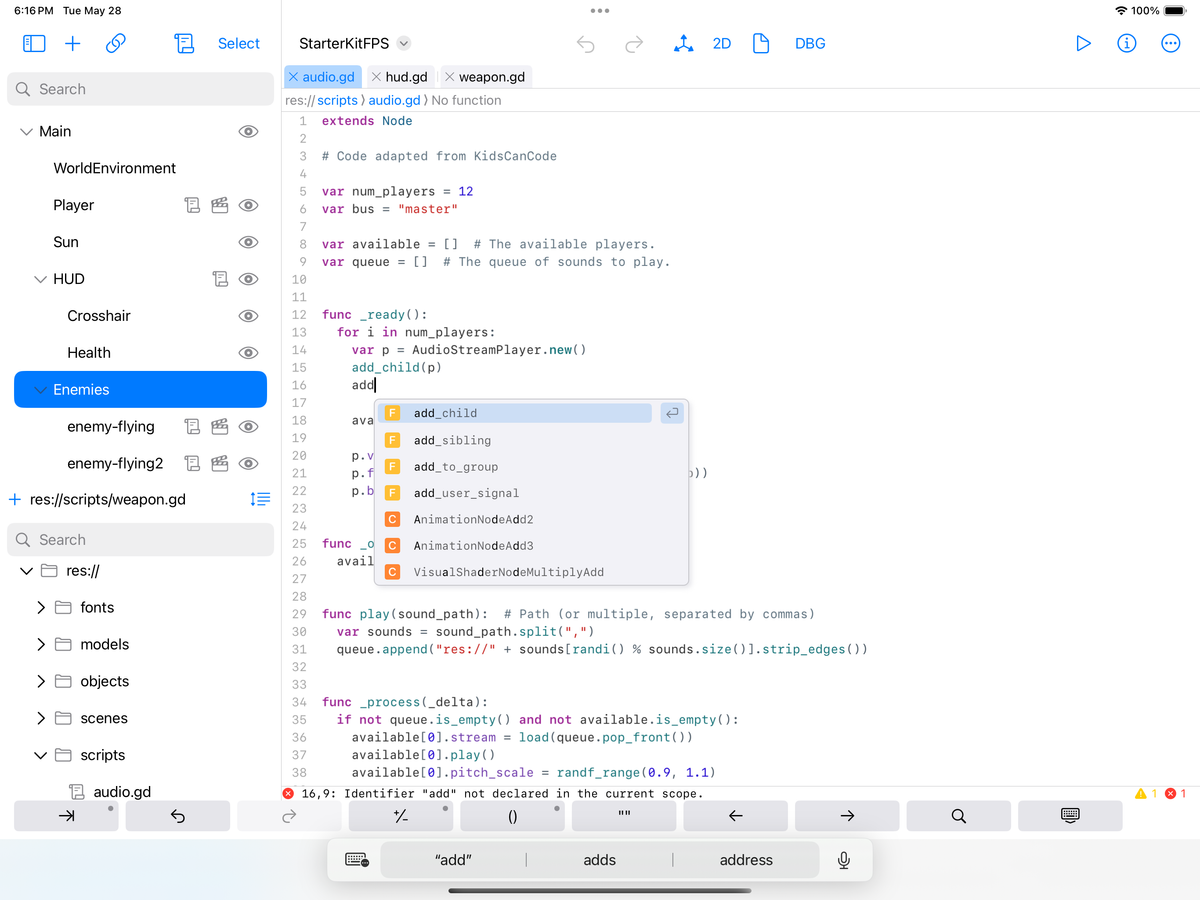
This post continues the series on creating an iPad-native UI for Godot using SwiftUI.
Today, I will discuss how I replaced the text editing experience in Godot for iPad with a native user experience.
The Godot editor is written as a Godot application, and the text editor for authoring code in Godot is no exception.
In the early days of Godot for iPad, we worked with the folks at Migeran to improve Godot's text input system on iOS so that we could continue to use the Godot text editor and other text-input elements unmodified—it seemed like the most efficient use of our time.
Godot's iOS support is focused on the needs of games rather than running the full-fledged editor. Our work was to address the limitations of text editing in iOS. The most pressing issue was implementing a virtual keyboard avoidance system; this requires the content in Godot to be scrolled or reduced to prevent the region where you are typing from obscuring by the keyboard.
This system works and is the fallback for any user interface elements not rewritten in SwiftUI.
However, given how much time users would spend in the code editor, I wanted to provide a native iPadOS editing experience and graft ideas from other code editing projects on the iPad. Among the apps I used were Codea (a Lua development environment), Pythonista (a Python development environment), Continuous (a .NET development environment for iOS), and, of course, Apple's own Swift Playgrounds.
Replacing the Godot code editor was not just a matter of adding a native iPadOS control but also ensuring that all the features users relied on were still present.
At first, this seemed like a daunting task.
The Text Editor
For the core text editing experience, I settled on using Simon B. Støvring's Runestone editor. Runestone is a great text editor with coding features: it offers great editing performance, excellent operating system integration via UITextInput, and, the cherry on top, its support for text coloring and automatic indentation via the tree-sitter project.
Tree-sitter offers robust and incremental parsers for programming languages, and text editors can use this functionality to provide text coloring and live indentation of code based on a grammar definition. Luckily, Preston Knopp had already written a GDScript grammar for Tree-sitter, so I got a pretty comprehensive editing experience for GDScript based on Runestone in little time.
Simon maintains a large repository for various grammars that you can plug into your project for different kinds of text files. To reduce my build times, I created a repository with only the languages I cared about (GDScript, JSON, XML, and Markdown).
Extending Runestone
Runestone ships as a UIKit library, but Godot for iPad is mainly written in SwiftUI, so I created a RunestoneUI wrapper that allowed me to consume it.
For the editing experience, I needed two additional features that Simon's Runestone does not currently cover. The first is the ability to have breakpoint indicators on the editor gutter and add/remove those breakpoints by tapping on that region. The second is to highlight the currently executing line when debugging.

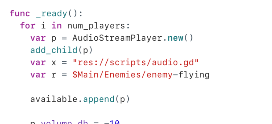
The breakpoint support is entirely implemented using the existing Runestone API. In the screenshot above you can see a limitation of this approach, Runestone is not aware of my breakpoint drawing, so the text for "2" and "3" is difficult to read. I think it is worth patching Runestone for this purpose.
The highlighting support did require some changes to the core of Runestone to display the current executing line with a special color (available on my fork). The only downside of requiring this change to Runestone is that anyone picking up my RunestoneUI relies on my Runestone change.
Editor Shell
Godot comes with a bespoke way of editing multiple scripts and text files:
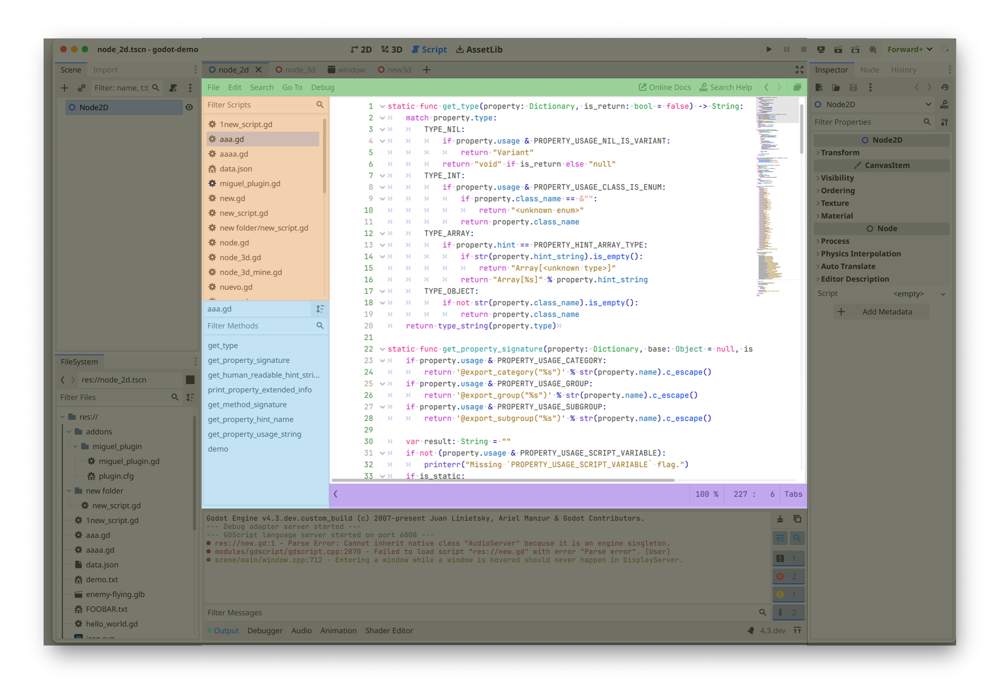
I had to put some of these regions on a diet, as users have less space on the iPad than they do on their desktops.
My top bar looks like this:

Green Region
The green region contains a traditional desktop set of menus that you would expect. I removed these menus and hosted some of the capabilities on the existing document and additional option menus. I drew inspiration from Swift Playground's layout for this one.
Orange Region
The Orange Region is the file switcher; it is a list of open files that allows users to switch quickly between them. The files are grouped by the scene that was selected when the file was opened, so it can get a little confusing.
Since this took up a lot of precious space on the iPad, I replaced this list of files with a tab-based interface. Rather than keeping files edited in scene groups, all the files you edit end up in the same group of tabs.
For the visual elements and color scheme, I drew inspiration from Xcode. I also borrowed another idiom from Xcode: you can tap on the individual elements of the file path and get a listing of files in that directory. The tappable path bar should alleviate some concerns about locating related files quickly.
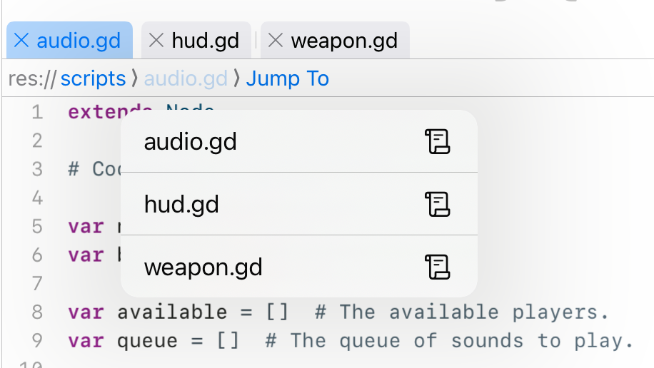
One list is gone, and one more to go.
Blue Region
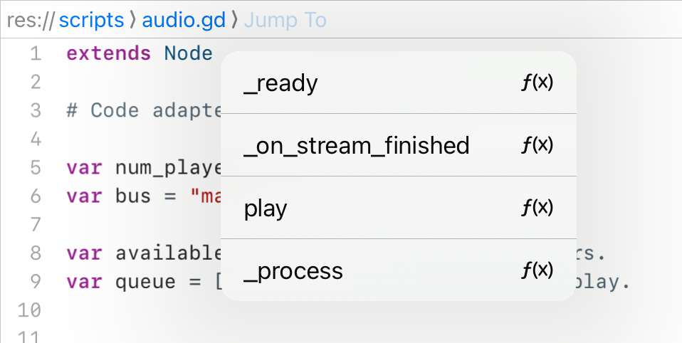
The Blue Region shows a map of functions in the file for quick navigation. Again, I took inspiration from Xcode to save some space. You can tap on the path bar's last element to display the current file's function map.
Drag and Drop
Users can drag and drop from the Scene Pad or the File System Pad into the editor:
Drag and drop is one of the few places where I had to use UIKit, as the SwiftUI drag-and-drop API did not contain the exact location of the drop inside the RuneStone text editor. When the user drops the file, the cursor will move to where the drop will occur.
Documentation
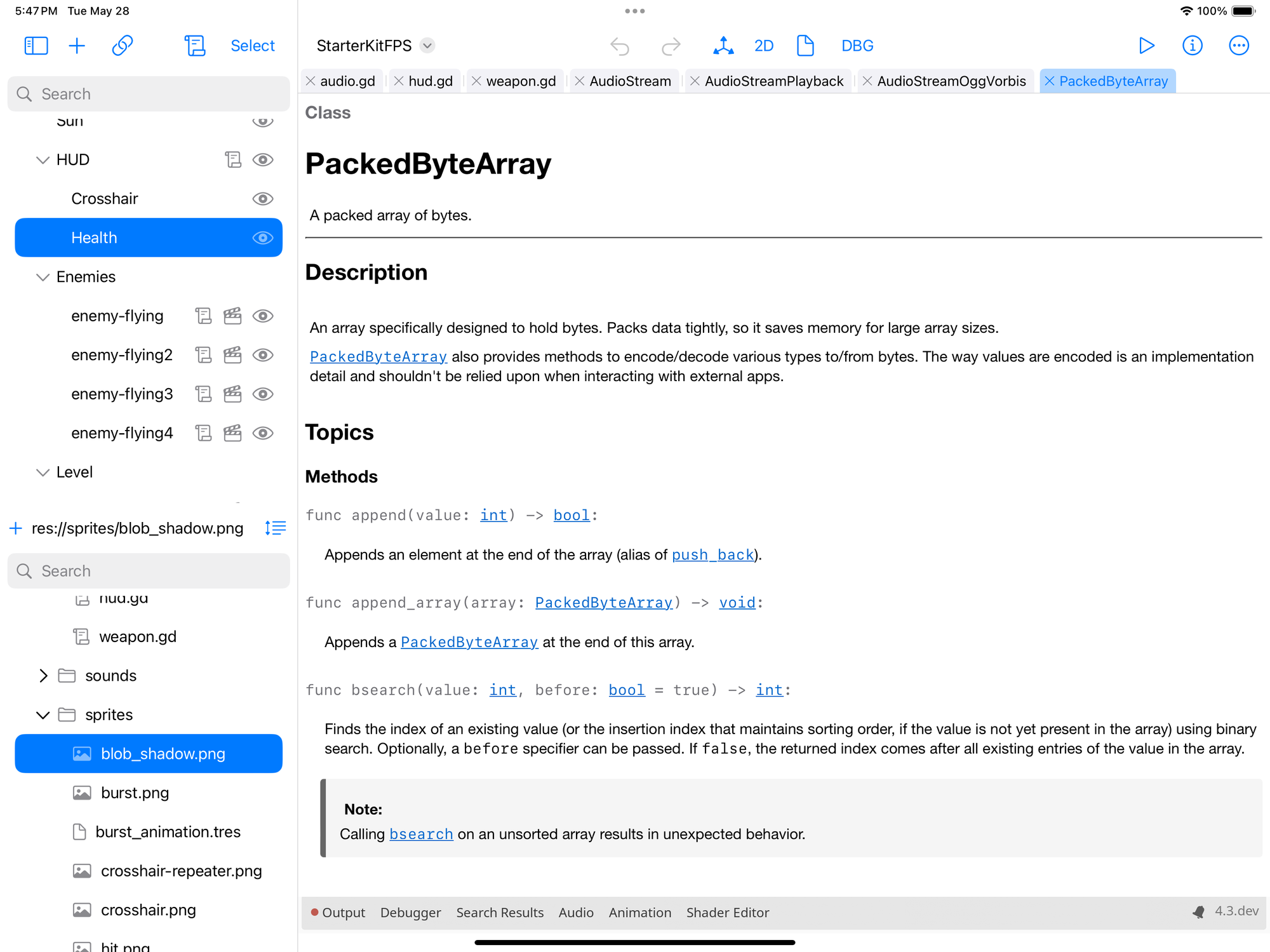
One of Godot's crown jewels is the API documentation, which they render in a tab in the code editor. I kept the same model that Godot uses in this case. However, I still had to render the documentation myself. I added support to the CodeEditorUI to render HTML pages and wrote a Godot markup to HTML conversion API, producing DocC-inspired documentation.
Code Completion and Error Reporting
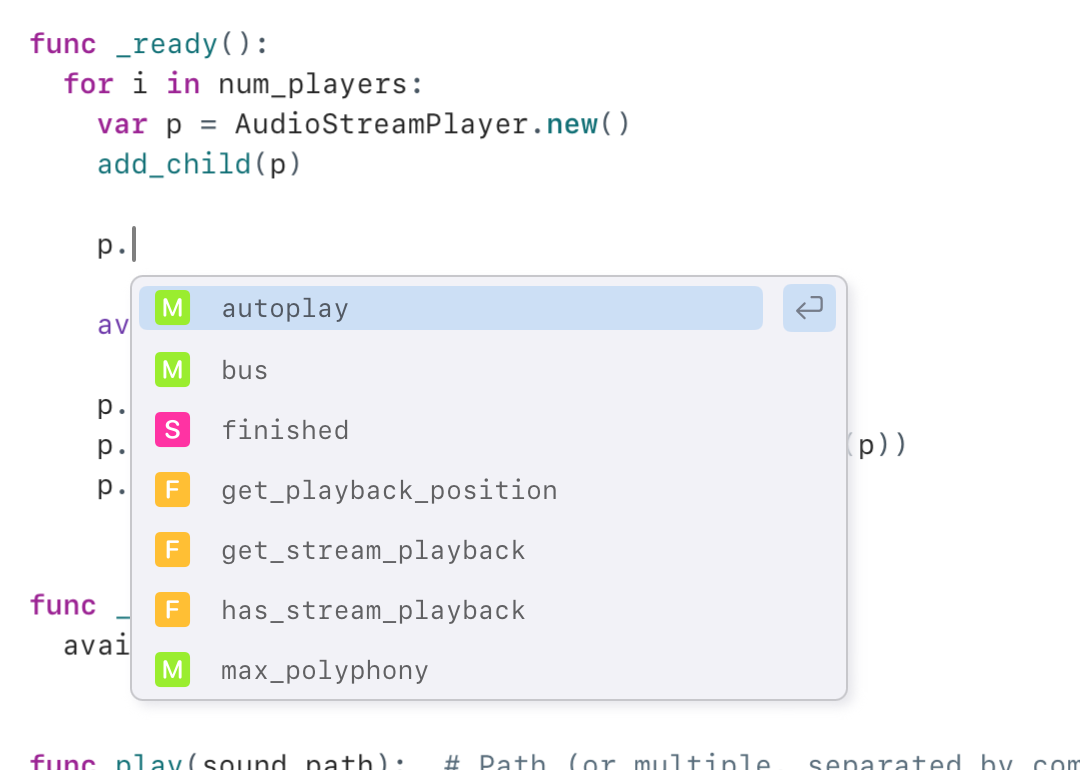
Swift Playgrounds heavily inspired the code completion look and feel. My colors are currently off, but I will rectify this mistake once I choose a palette for Godot on iPad.
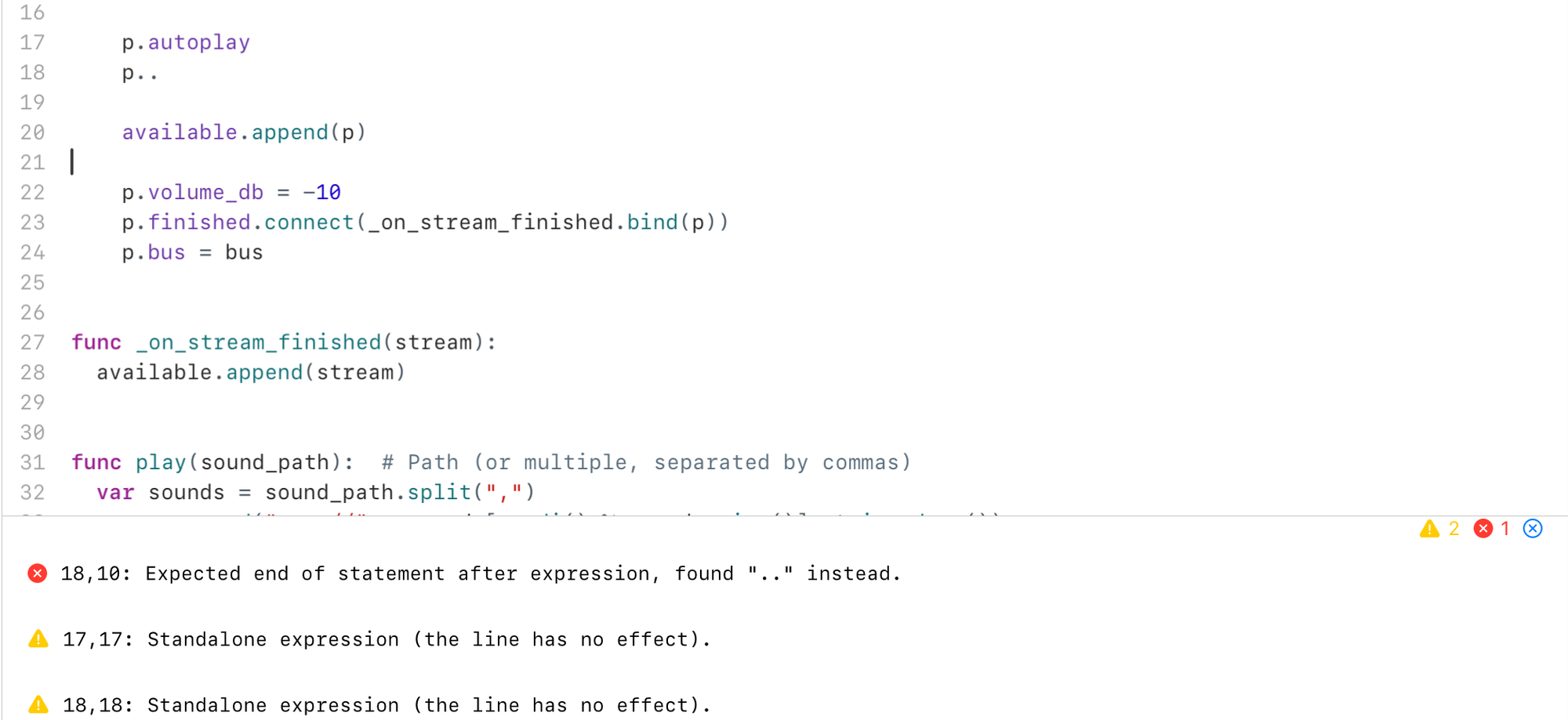
I am relatively new to GDScript and curious to know how language users expect syntax errors to appear. For now, I am playing it safe, and I surface the same experience that Godot does, which is to update the text editor interface with the compilation errors live at the bottom of the screen (by default, I display one line, but in this example, I tapped to expand the view):
Keyboard Accessory
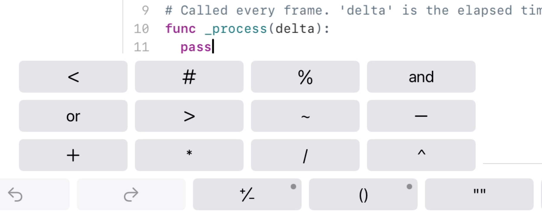
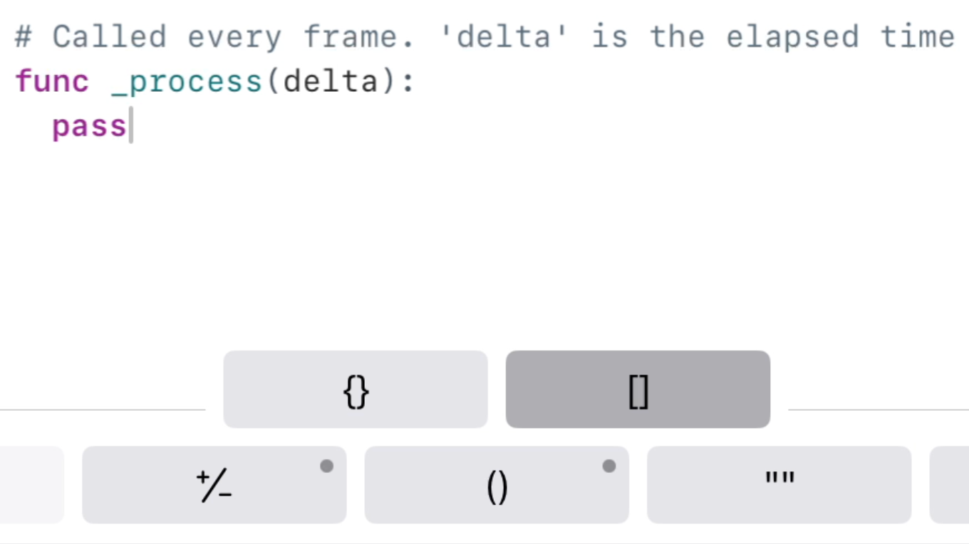
I loved what Codea did with their keyboard input accessory, so we brought a GDScript-based version of it, where keys with a little dot on top show a popup menu with the everyday operations for that key, along with convenience functions like indent/unindent:

Long pressing on the +/- button shows a popup:
Long pressing on the parenthesis offers a couple of additional shortcuts:
CodeEditorUI
To reduce my build times and help me develop faster, I split out all the code related to the editor shell described in this blog post. You can find it in the CodeEditorUI GitHub repo.
Most of the code here uses idioms you would find in other projects. Two things are worth showing, as they are idioms that I have been using in this project.
First, I tend to put my data on a class that has been flagged with SwiftUI's @Observable macro. The UI is driven entirely by the state of this class, and changes to the UI are made by invoking methods that change this observable class.
For example, the data source for the text being edited lives in the EditedItem @Observable class. The corresponding visual rendering happens in the CodeEditorView.
The second is a mechanism for issuing commands to the underlying control. These commands can request the editor scroll to a particular line or launch the UI for search and replace.
I am unaware of a common idiom in SwiftUI that can be used to do this, so I devised a system that relies on creating an instance of a "command" object, which you pass to the RunestoneUI control.
Behind the scenes, the command object receives a pointer to the native UIView, which it can then control. If you think this feels like a hack, you are not alone. I am spiritually aligned with you, but I could not figure out any other way of making this work.
I use the new SwiftUI observable framework everywhere in this project, and in retrospect, I am sure that I would not have attempted this effort if I had to rely on the old way of monitoring changes. This macro is the difference between a life of misery and despair and pure, unadulterated hacking joy.
